
Project information:
Shamir – Technological Education Institute | Brand Identity
Read MoreThe Challenge:
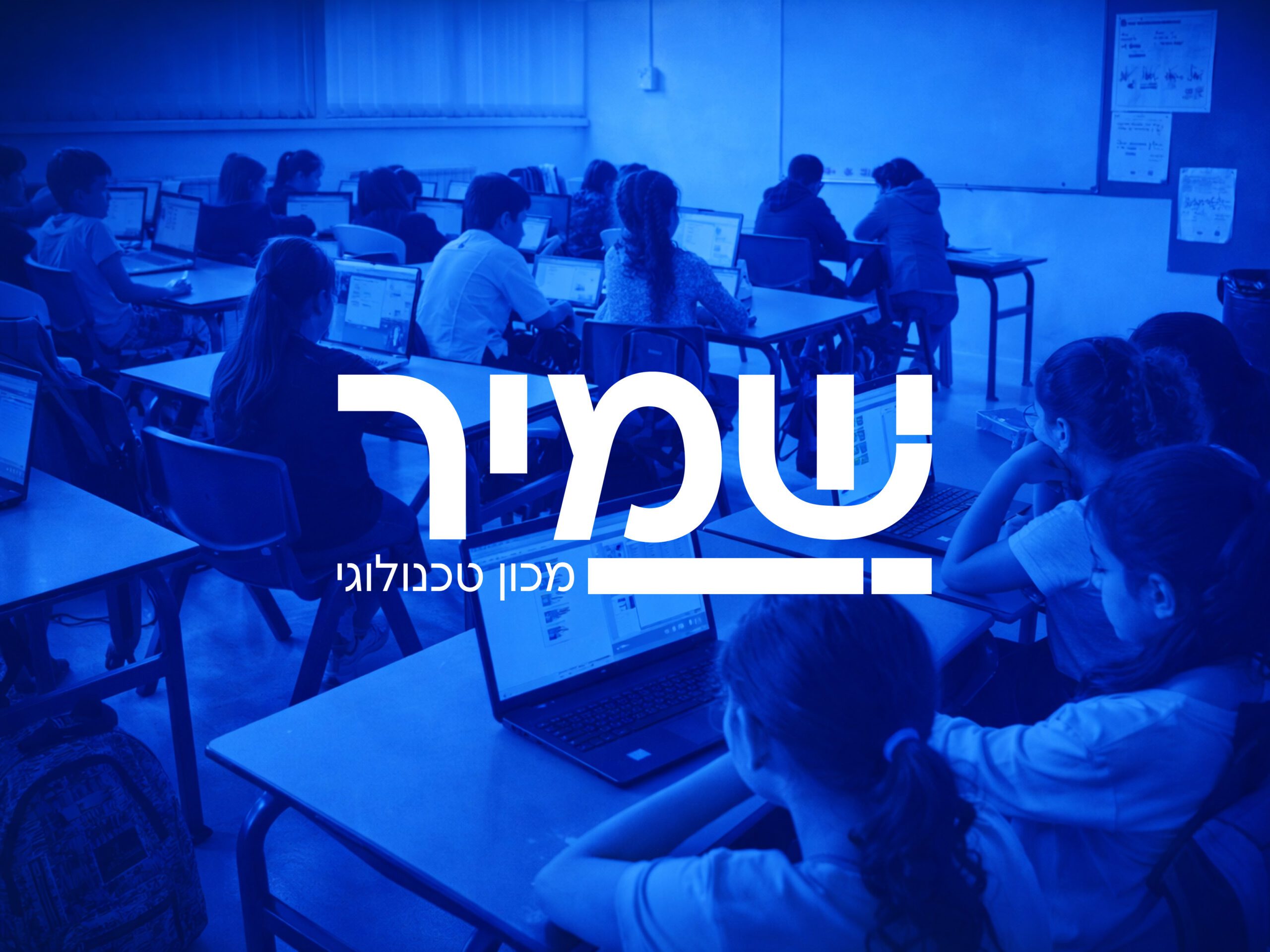
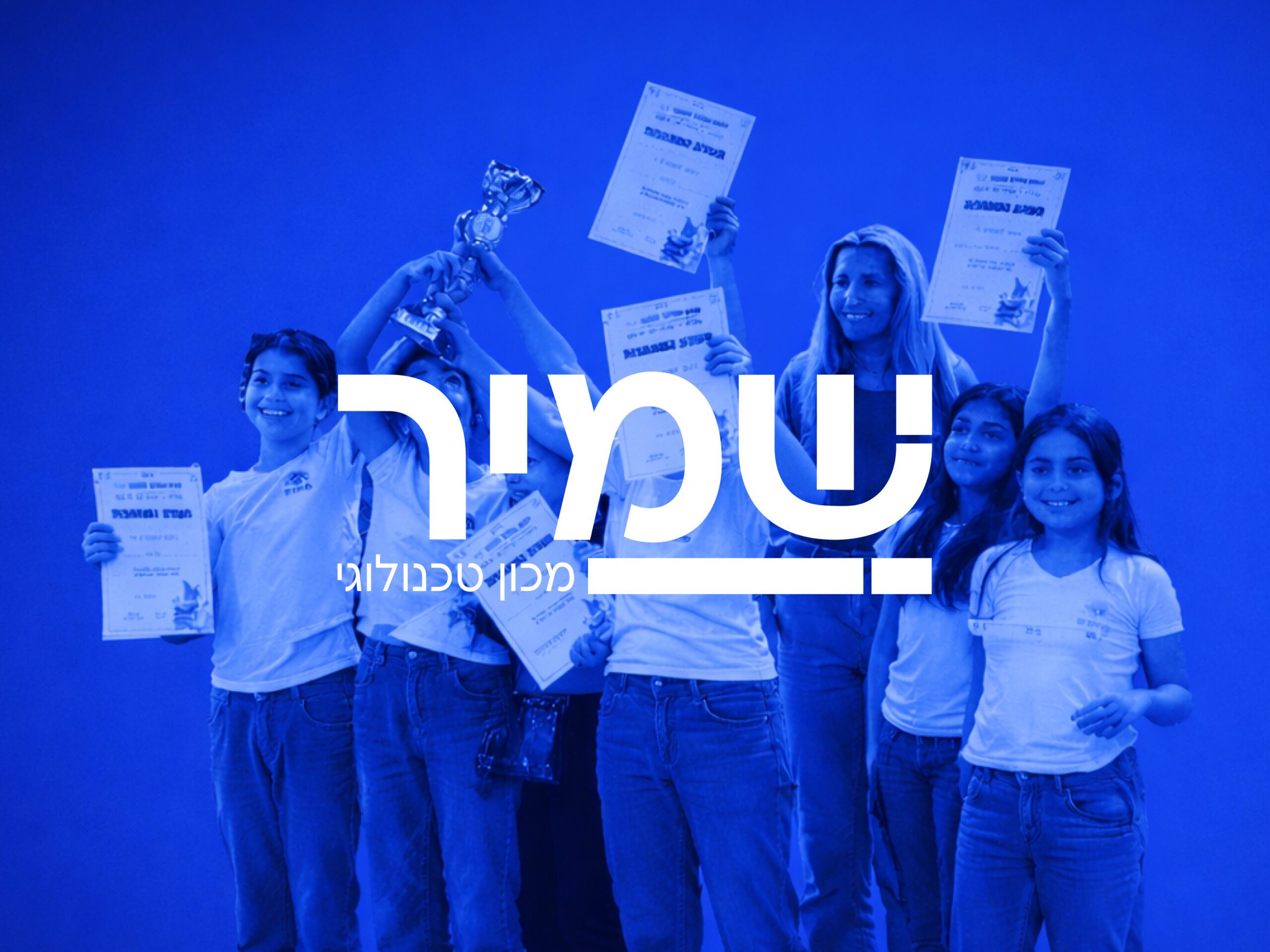
Shamir operates at the intersection of education and technology, with a strong emphasis on human-centered learning. The challenge was to create a brand identity that reflects innovation and technological expertise, while remaining approachable, clear, and deeply connected to people—not machines.
The Solution:
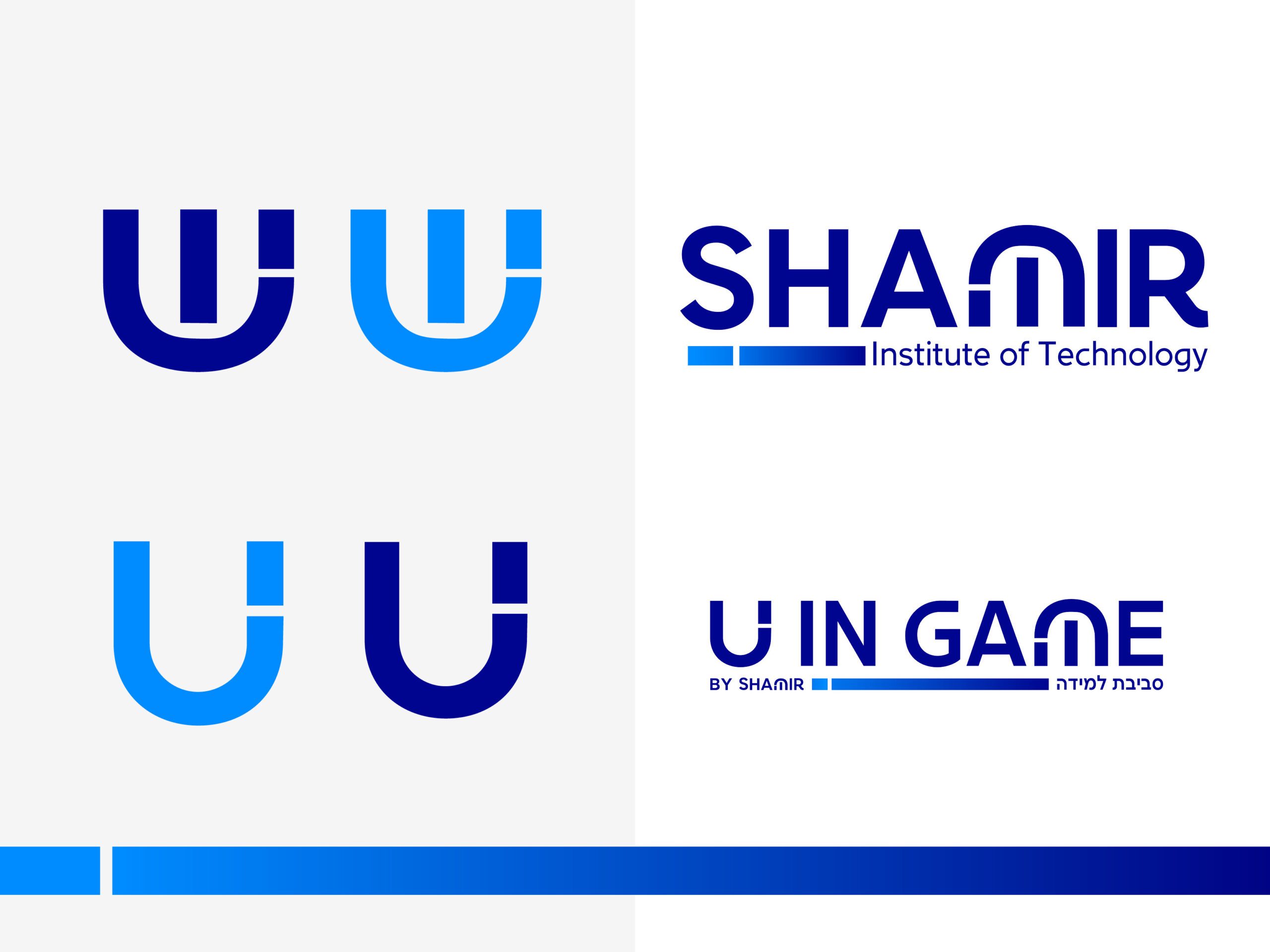
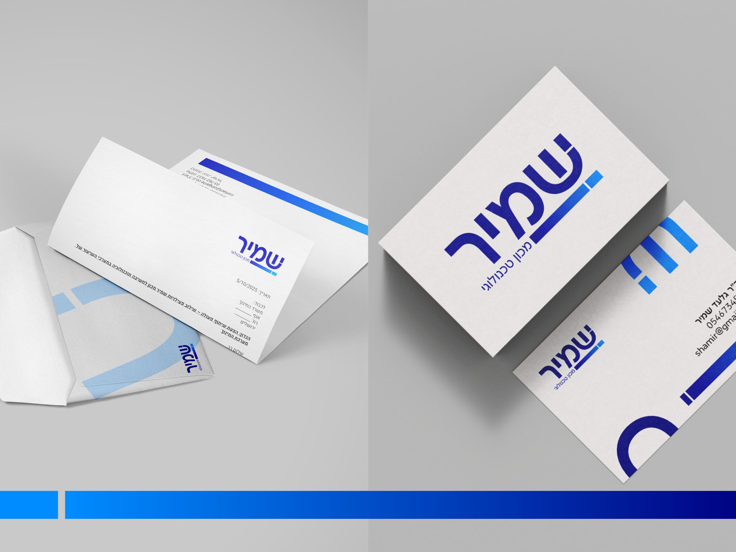
I developed a visual identity built on balance: precise yet human, modern yet warm. The logo is set in a rounded, open typeface that communicates accessibility and trust alongside professionalism. A calm blue palette reinforces clarity, confidence, and innovation, while maintaining a sense of youthful energy.
The letter Shin (ש) was designed as a standalone symbol—referencing a digital button or interface icon—subtly expressing the connection between learning, technology, and interaction.
The result is a cohesive identity that supports Shamir’s vision: empowering learners to move from consuming technology to shaping the future with it.