Project information:
MIDVED – Engineering Economics | Brand Identity
Read MoreThe Challenge:
MIDVED is an established engineering economics company with over a decade of experience, operating at the intersection of technology, infrastructure, and financial strategy.
As the company evolved, its existing visual identity no longer reflected its positioning. The previous logo and graphic language felt outdated and lacked the clarity, precision, and professionalism that define the company today.
The challenge was to create a renewed identity that communicates technological expertise and structured thinking, while remaining clear, confident, and contemporary.
The Solution:
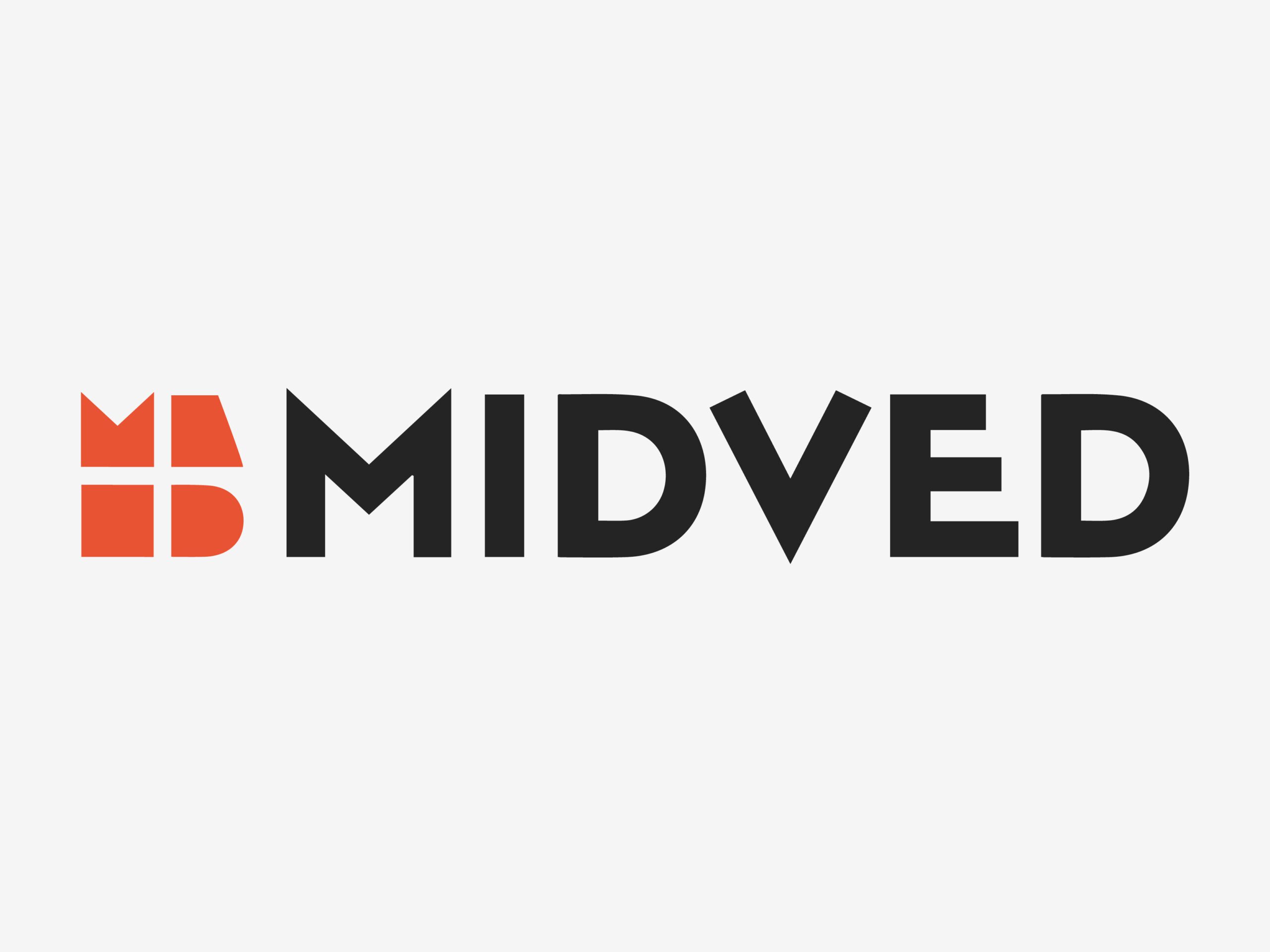
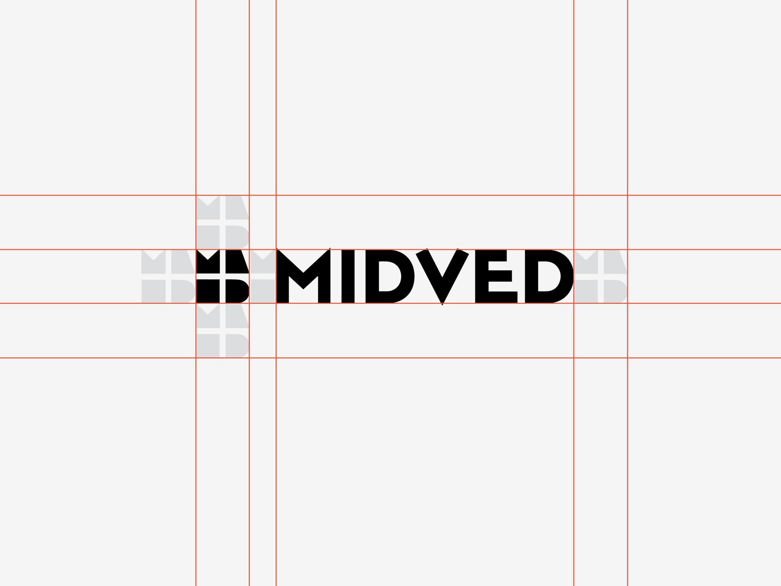
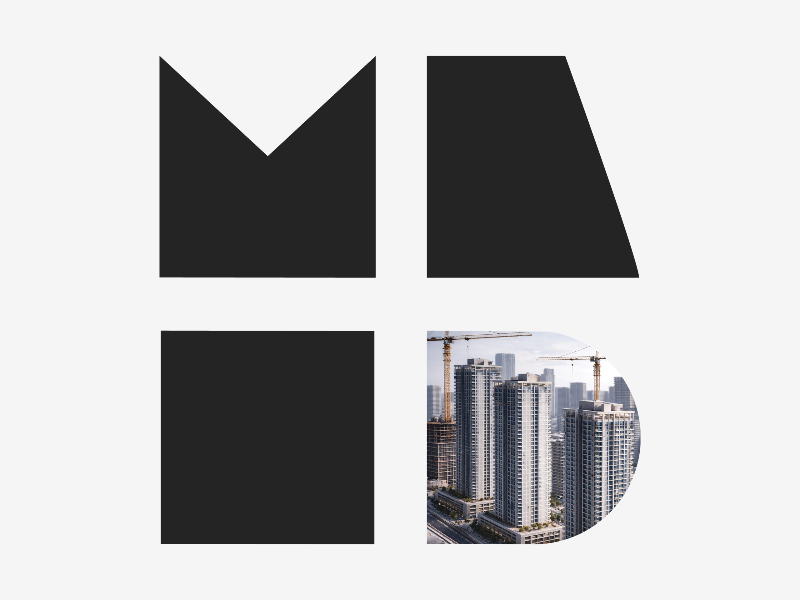
The new identity is built from a modular visual system, derived from a geometric grid. The logo is constructed from four distinct units, forming a cohesive structure that reflects systems, logic, and engineered thinking.
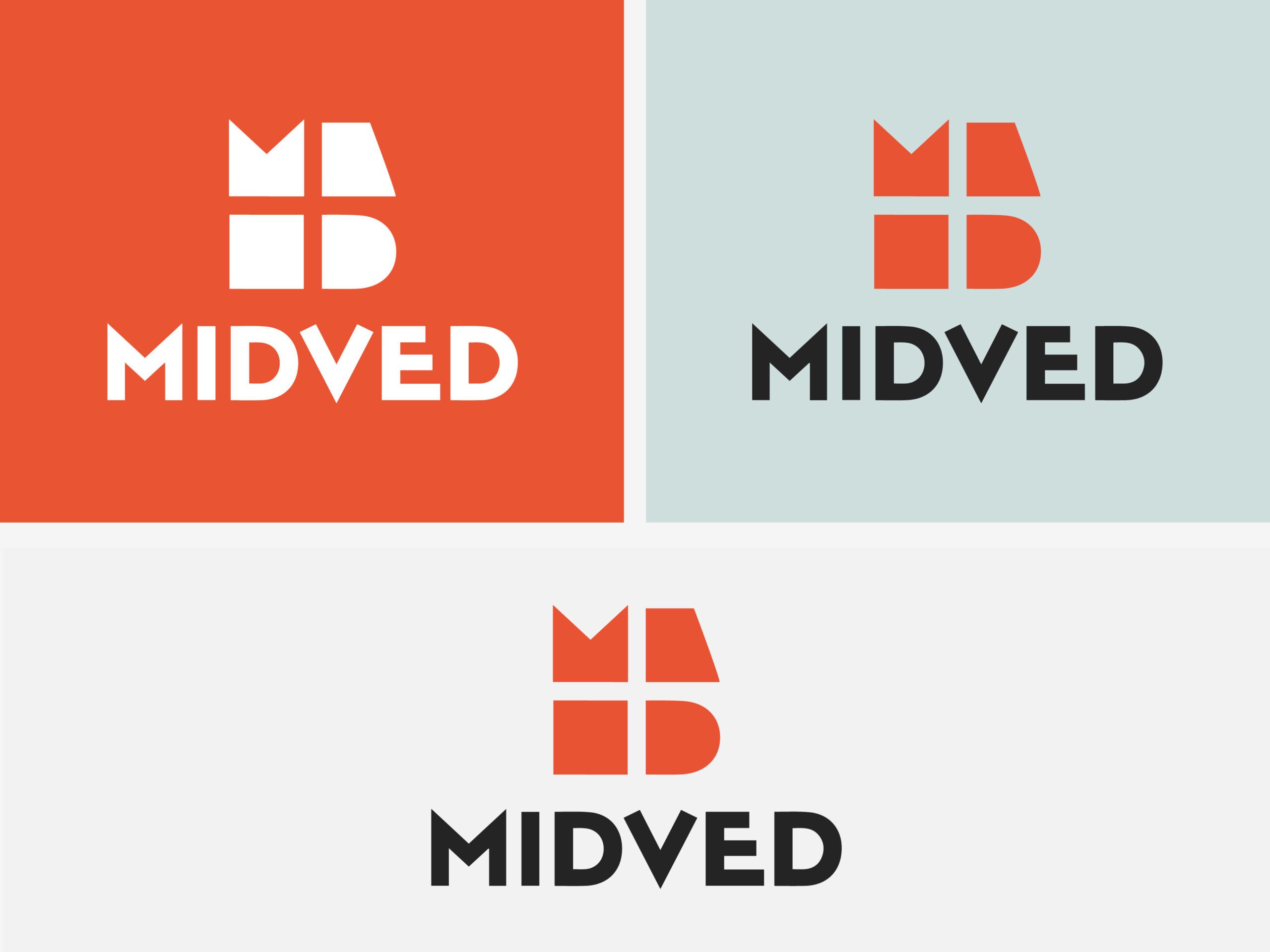
This modularity allows flexibility across applications, while maintaining a strong and recognizable core.
The typographic language is clean and precise, supporting a sense of clarity and trust. The color palette balances technological confidence with approachability, using a restrained, contemporary range.
At the center of the identity lies a subtle gesture: a negative “+” shape formed between the units — symbolizing connection, addition, and value creation. This reflects MIDVED’s role in bridging engineering, economics, and strategic thinking.
The result is a structured yet flexible identity system that positions MIDVED as a modern, forward-thinking company rooted in clarity, logic, and precision.