Project information:
Zabar Plus – Brand Identity for a Renewable Energy Company
Read MoreThe Challenge:
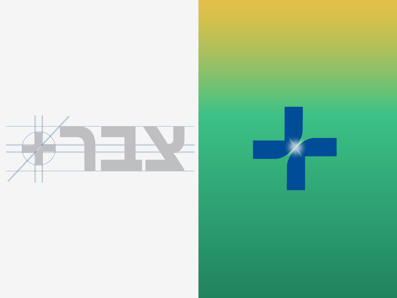
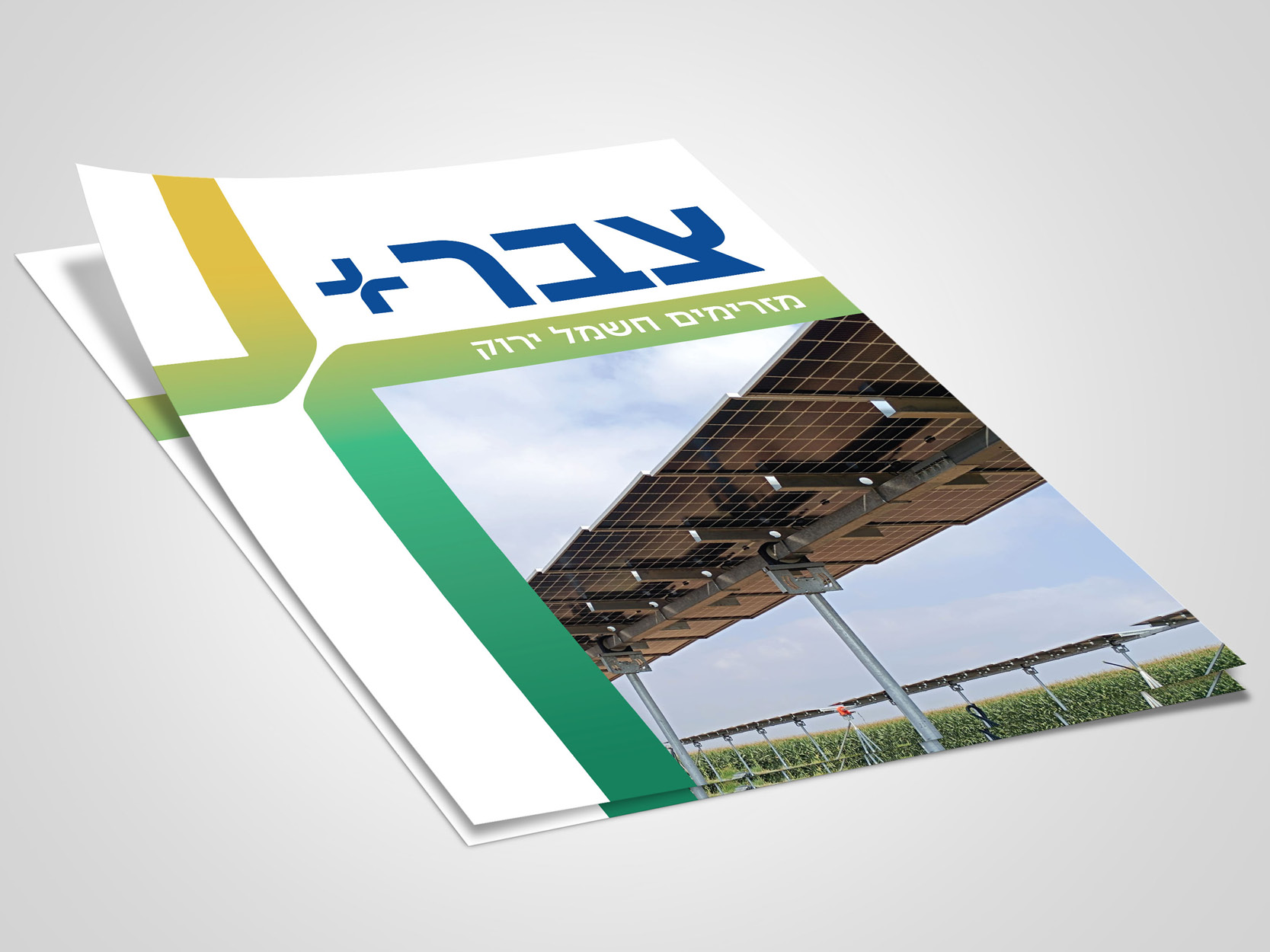
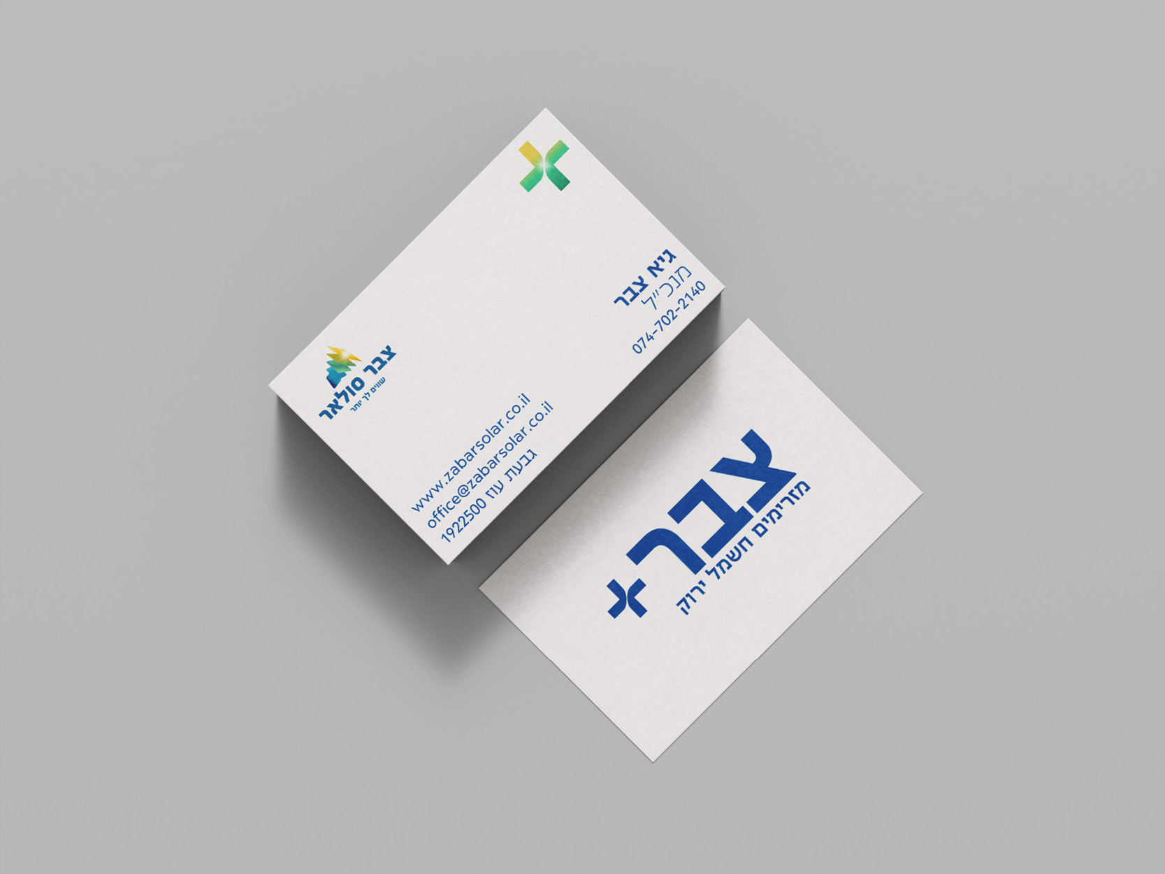
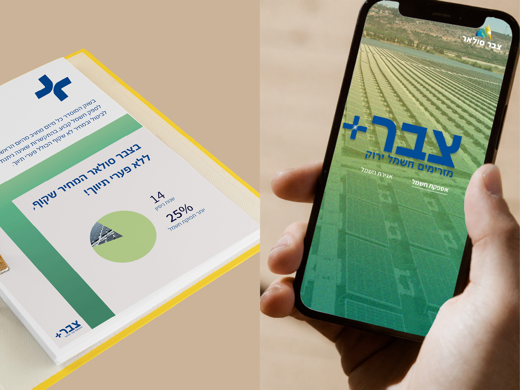
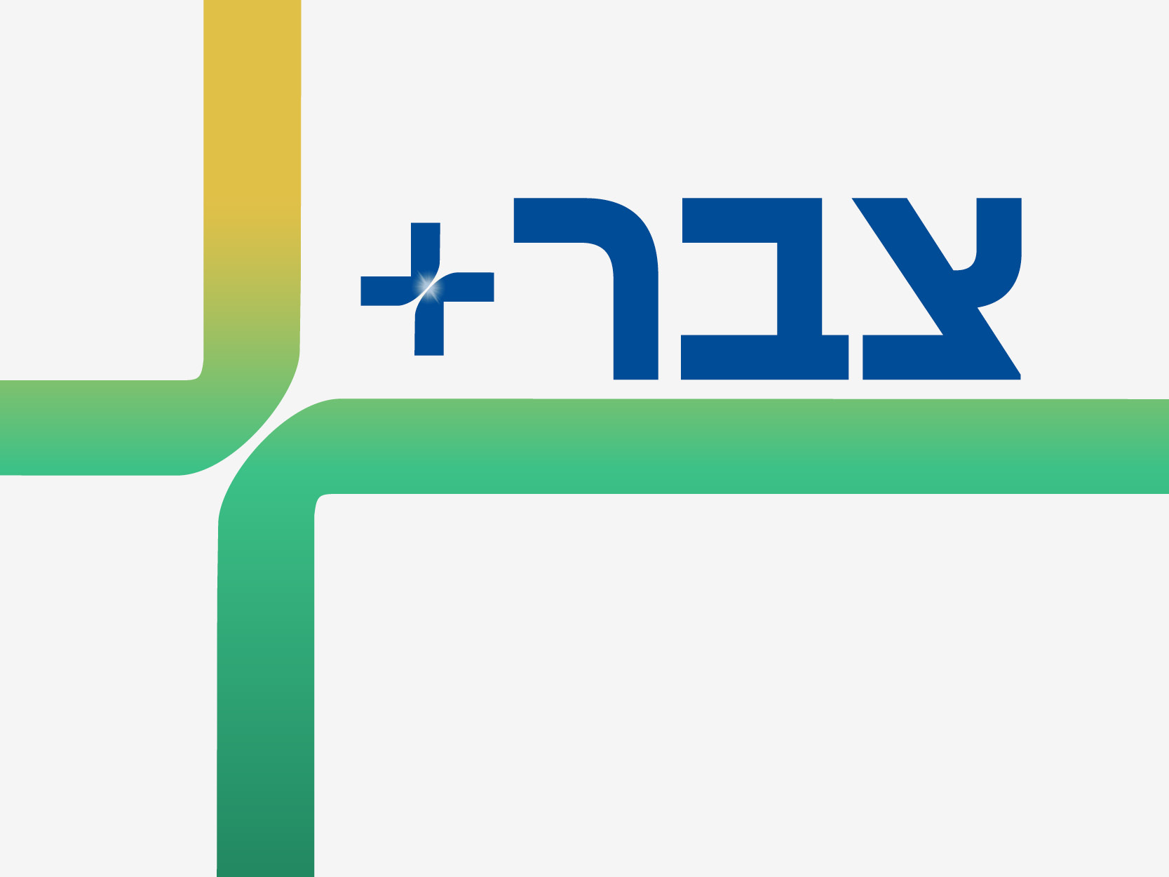
The challenge was to create a new logo that felt fresh and dynamic, but still aligned with Zabar Solar’s established presence. I developed a bold, refined wordmark using a modern, semi-heavy typeface that echoes the original logo. The signature Zabar blue remains, but with a slightly softened, more contemporary tone. To reflect Zabar Plus’s future-facing approach, I introduced a new color accent—greens and yellows—that convey energy, optimism, and environmental awareness.
The Solution:
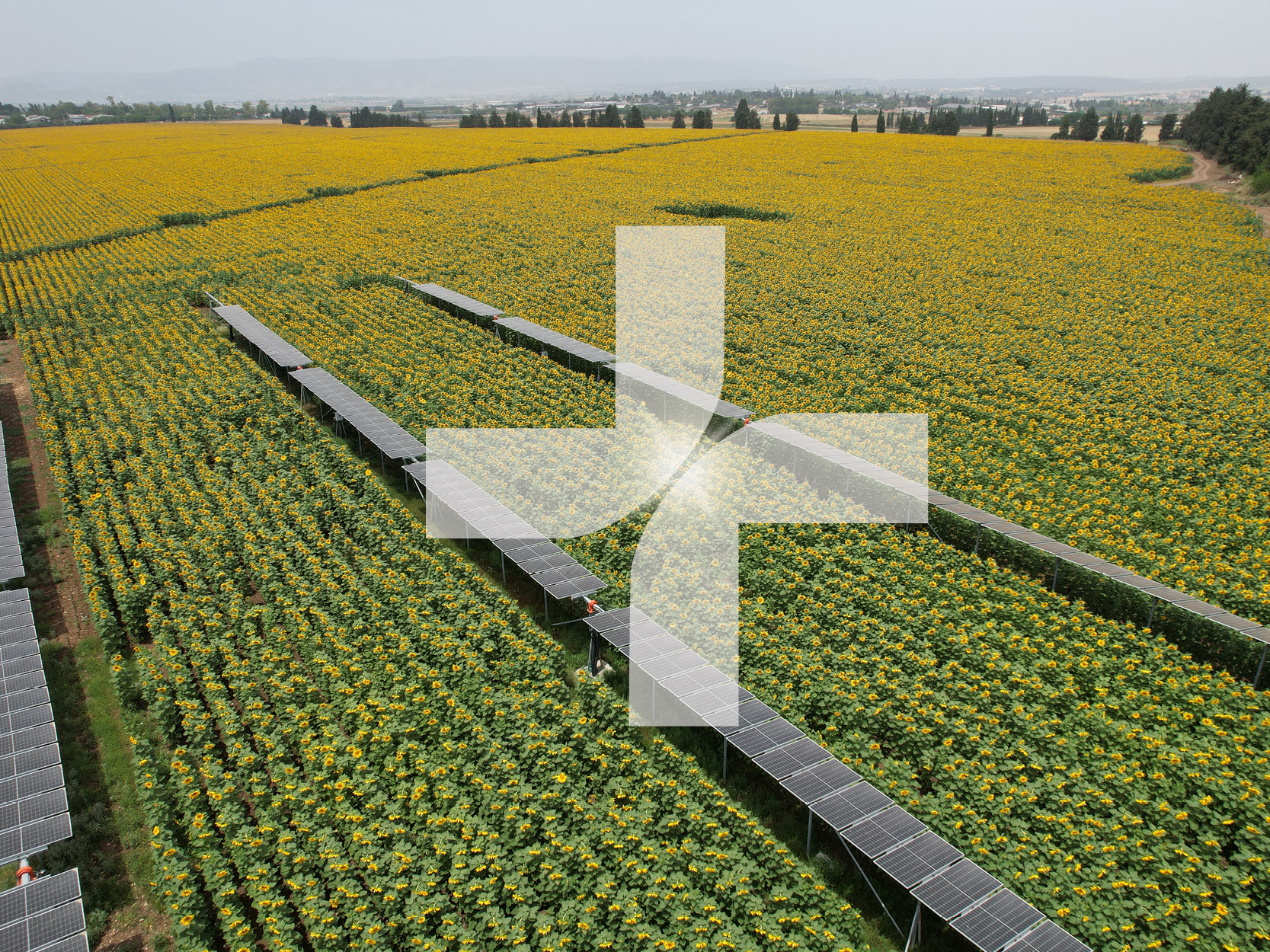
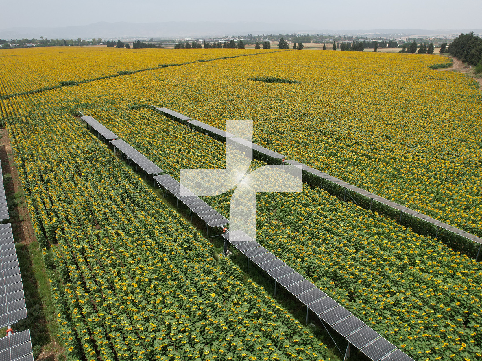
The “Plus” symbol was designed as a subtle graphic element formed by two intersecting shapes, giving it a playful, flexible feel that can evolve into a broader visual language. This element will appear across design assets, adding a layer of motion and clarity.
The result is a cohesive, modern brand that communicates trust, intelligence, and innovation—anchored to the legacy of Zabar Solar, while carving out a distinct, forward-looking identity of its own.